The Colors of Relaxation
Sunshine. Beach. Turquois water. All mental images that conjure a relaxing sigh. In the spirit of Tommy Bahama’s National Relaxation Day, we look at inspiring seascapes and their color palettes and attempt to translate their calming energy into interior design.
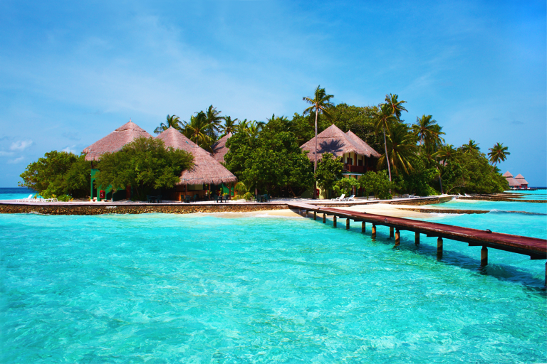
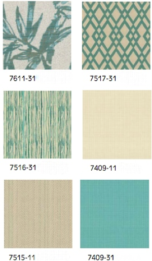
Drawing inspiration from white sand beaches, Polynesian bungalows, palm trees and teal-colored seas, the color palette below focuses on the spa-like qualities of island life.
 \
\
True to its name, Ocean Club embodies this island spirit through its east-meets-west design common throughout the South Pacific Islands. The collection thoughtfully incorporates wave motifs – as shown in the etched sea glass on the sideboard, linear architecture and a two-tone finish. The collection also purposefully utilizes light. This is especially apparent in the mirror’s complex finish, a sun-drenched sienna coloration to the front and the walnut finish as the backdrop, which highlights its radial slat design. The subtle illumination is similar to what one might experience in the evening hours on the beach.
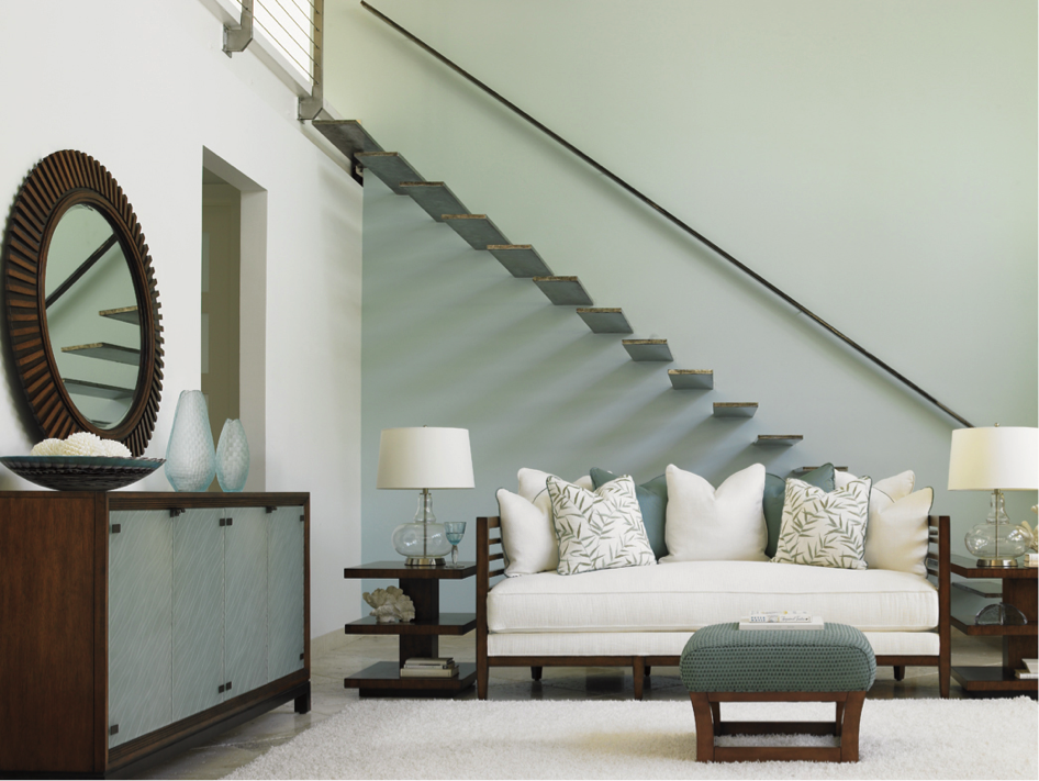
In terms of color, the collection utilizes neutral-toned base cloths with aqua colored accents. Palm prints on the throw pillows add a tropical feel to the group, while the dark finish of the frames contrasts the lighter hues throughout the room.
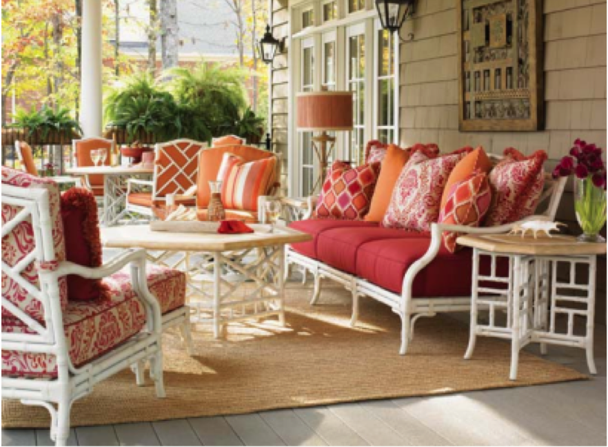
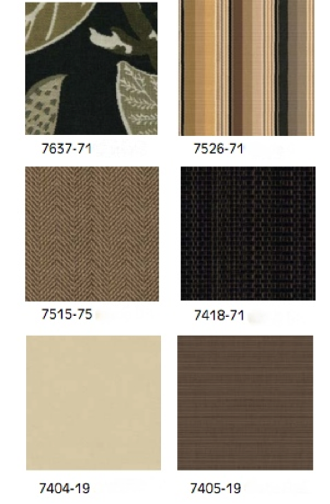
Our next color palette consists of burnt oranges, vibrant reds, soft pinks tied together with earth-tone neutrals. The vision for this palette is taken from the spectacular colors of a sunset on the sea.
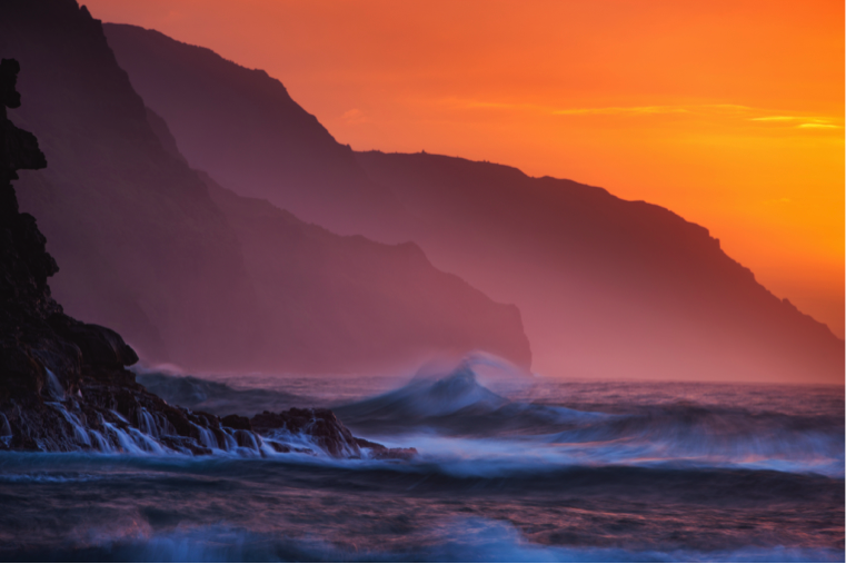
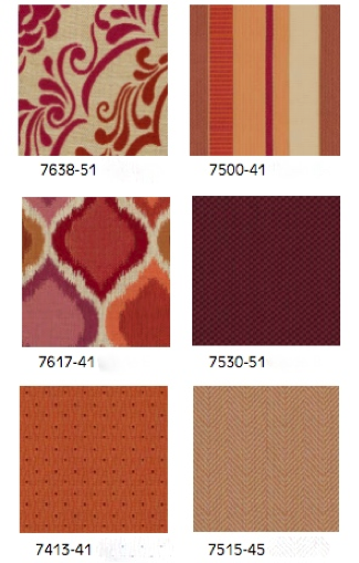
To translate this seascape setting into your home, look for natural looking frames – think rattans, wicker, etc. – or materials that mimic this style. Keeping the frame in a neutral color and adding cushions and pillows that incorporate more vibrant hues will create a dramatic effect – similar to what one might encounter while watching a spectacular sunset. To complete the look, add an accent rug made of sisal, cocktail tables with weatherstone tops and sea-inspired accessories like conks and seashells.
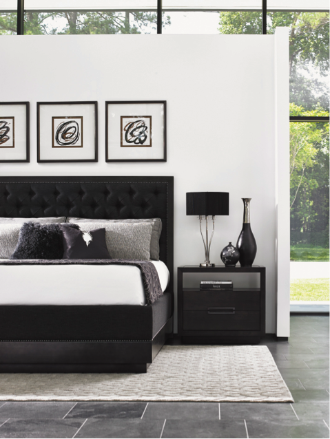
Another striking landscape is that of black sand beaches. The stark contrast of the black beach with the cresting white waves creates a serene, yet vivid setting. Accented with green palms and aqua water the seashore feels minimalistic and tranquil.
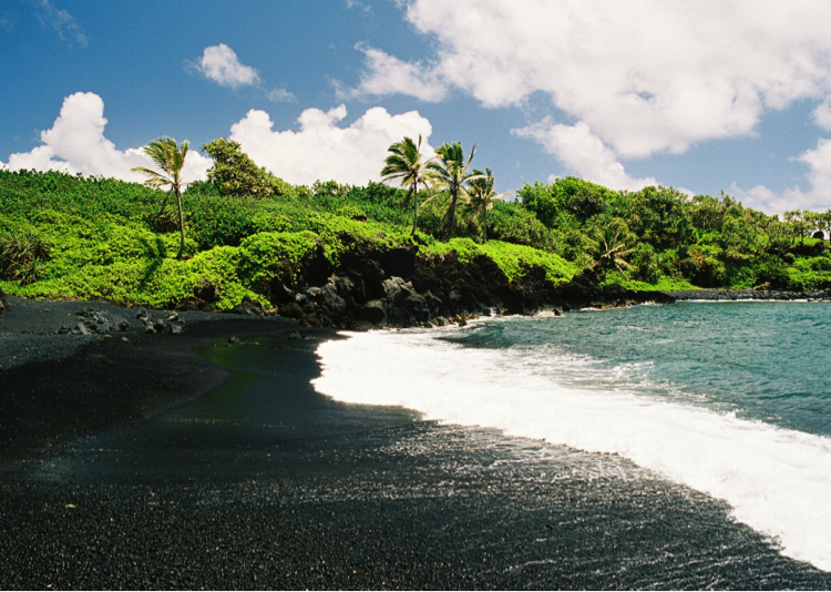
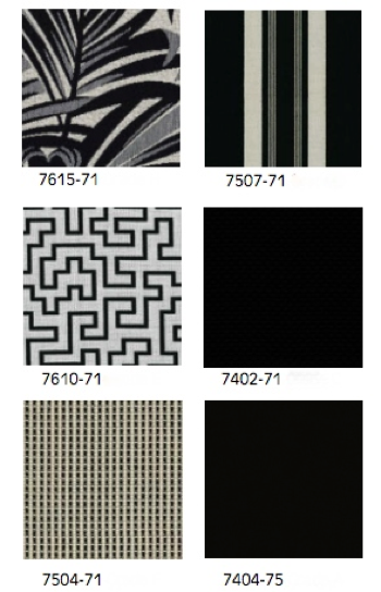
Creating this ambiance indoors, we utilize contemporary design to keep the same uncomplicated approach as Mother Nature. The Carerra collection featured below utilizes rich charcoals and opulent greys distinctly balanced with light neutrals and hints of metallic accents – similar to what one might find on the shores of a black beach. Note the use of slate tile and white walls, creating equanimity through stark contrast.
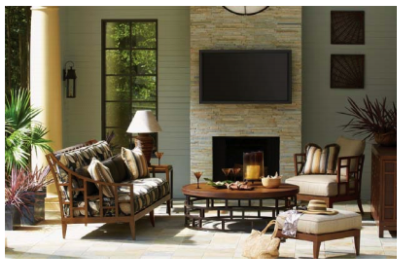
Our last relaxing palette highlights colors found near the sea in the evening hours when the light shifts to a golden color and the rays seem a little softer. It highlights hues of gold, grey, and tan tied together by dark greens and blues.

Translated into a living room setting, you’ll notice the medium chestnut hue of the furniture frames and tops, contrasted with neutral base cloths and enhanced with printed fabrics. The cocktail table emulates the sophisticated look of crushed bamboo, while the style of the furniture frames is consistent with the natural look of woven rattan. Greenery and a stone fireplace complete the seaside look.
While we cannot always escape the pressures and worries of the modern world, we can create serene escapes that mimic those places we enjoy unwinding most. So, kick back and enjoy National Relaxation Day!
What elements of design do you think are most important for creating calm, relaxing spaces?
What color palette do you use most often to create a serene space?
Back to Blog