In this post, we explore a sophisticated color palette featuring soft gray and ivory tones accented by bold punches of burnt orange and terracotta.
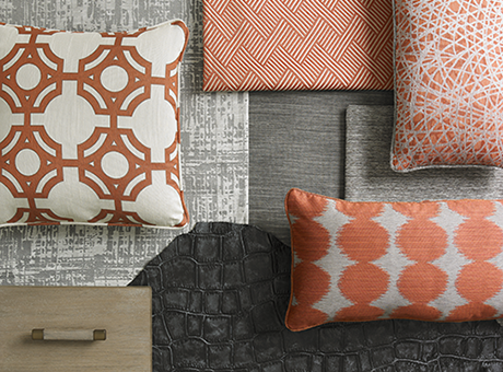
Dimension is achieved through fun patterns, such as the iron gate design, embossed crocodile and abstract spirograph as highlighted above. Geometrics are proving hot as is highlighted by the bold circle and structured zig-zag patterns.
.png)
When using in the home, the look is often contemporary, yet warm. The color palette pairs well with brushed metal and weathered-gray finishes. As shown above, the neutral finish of the cocktail table and accent chairs provides a foundation from which pops of colors can be added. We are particularly fond of the zig-zag application on the accent chairs.
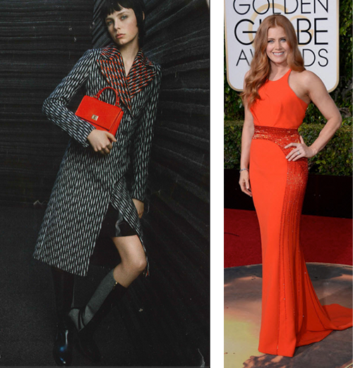
High fashion has also adopted the color palette, applying fun geometrics to classic silhouettes in a neutral gray, and adding bursts of color. The red carpet at the most recent Golden Globes saw a variety of orange and rose hues with touches of metallic.
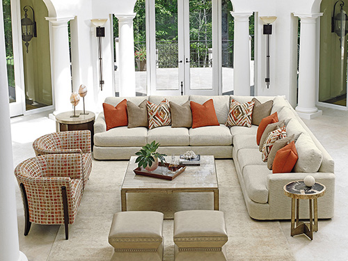
In more casual environments, we are seeing pops of colors added through the use of accent pillows and chairs, again keeping the foundation in a neutral tone, as shown above in a soft ivory coloration. Hints of metallic are added throughout the room through nailhead on the ottomans, as well as the metal accents on the cocktail and lamp tables.
.jpg)
Applying an iron gate and swirl pattern in a neutral gray and ivory, creates a sophisticated muted look, which enhances the sofa's subtle strie fabric.
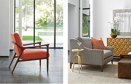
The gray and orange palette also work in a mid-century modern setting, where the minimal lines of the furniture and open concept of the home allow bold furnishings to take center stage. The Warren chair is a great example of this. The accent pillow in the right image shows the sophisticated use of pattern-on-pattern while the metallic look of the martini table and chest completes the look.
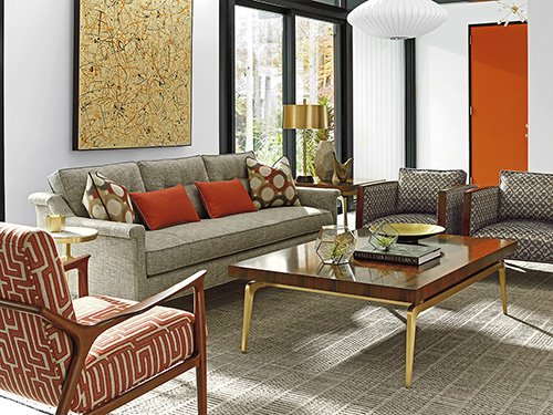
Finally, we see the last setting showcasing the use of terracotta in a fun geometric pattern on a mid-century modern chair while a bold orange is used as an accent on the door and pillows. Keeping the walls ivory and adding metallic touches keeps the room feeling refined.
Now that we've shared one of our favorite palettes, it's your turn.
What are some of your favorite color combinations?
How do you use gray and orange in the home?
Back to Blog